

The project brief involved getting two words: both having different meanings, but being spelled the same. We had the space to be able to translate that into a design of our choosing, however the word had to be in the design.
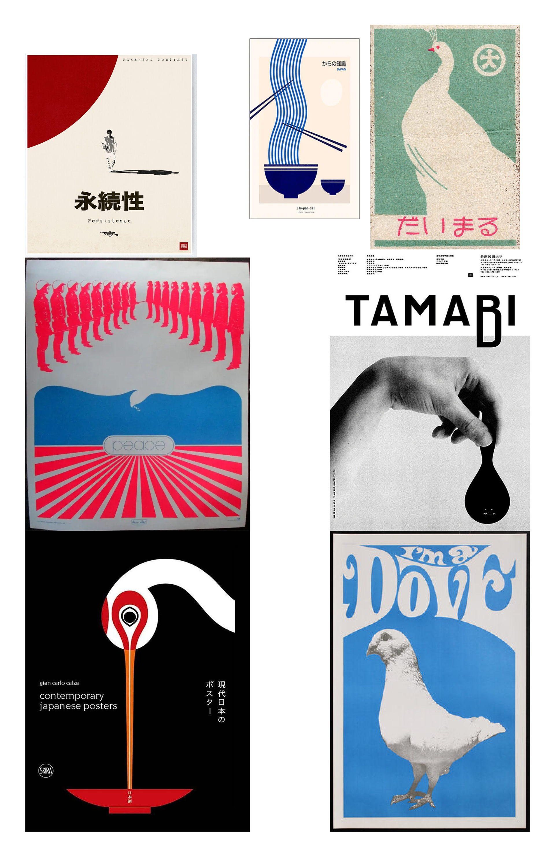
My research process involved looking at Japanese posters and design. I had the word: DOVE. I wanted to do something really basic, so I leaned into looking at posters and graphic design that reinforced minimalist Japanese design.
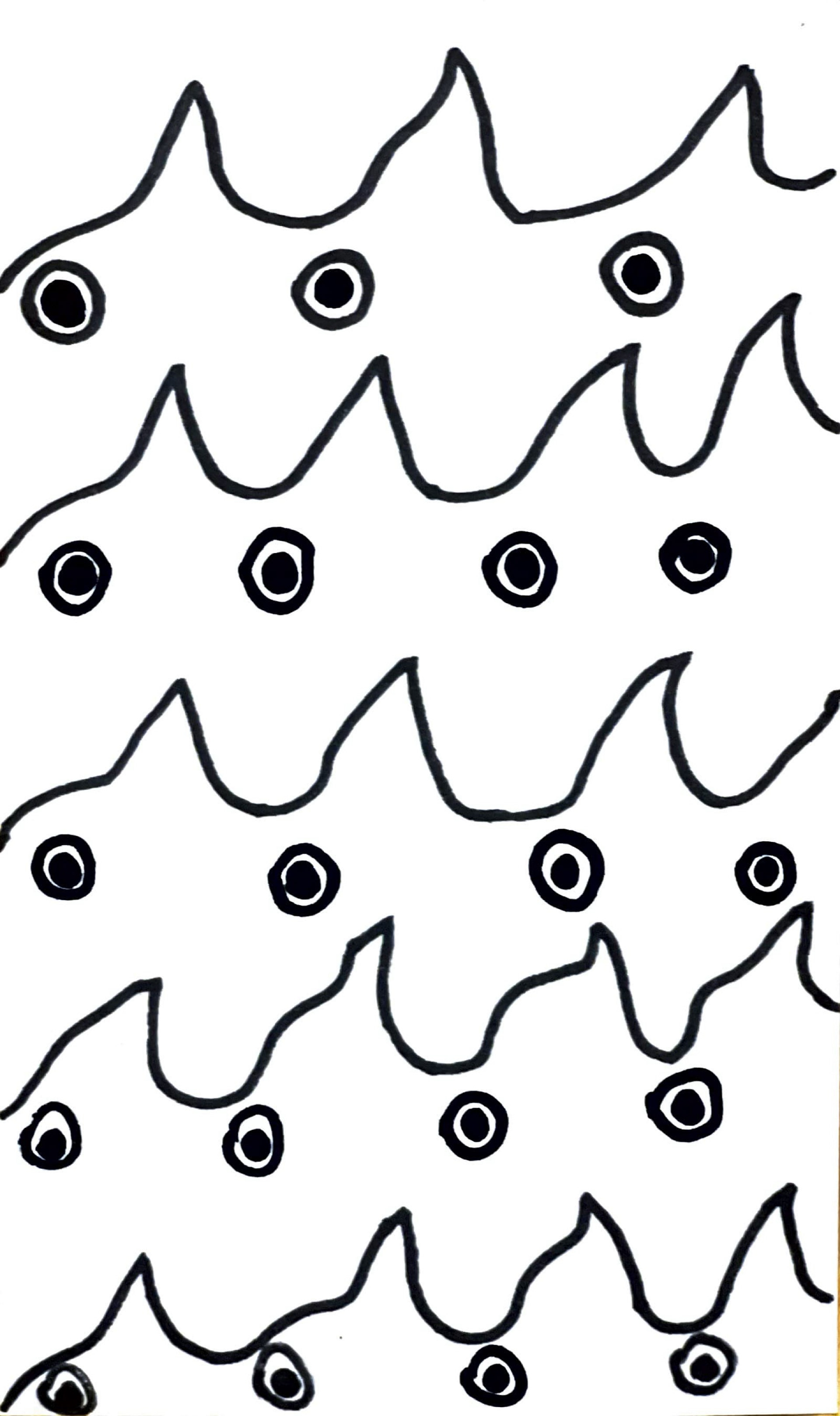
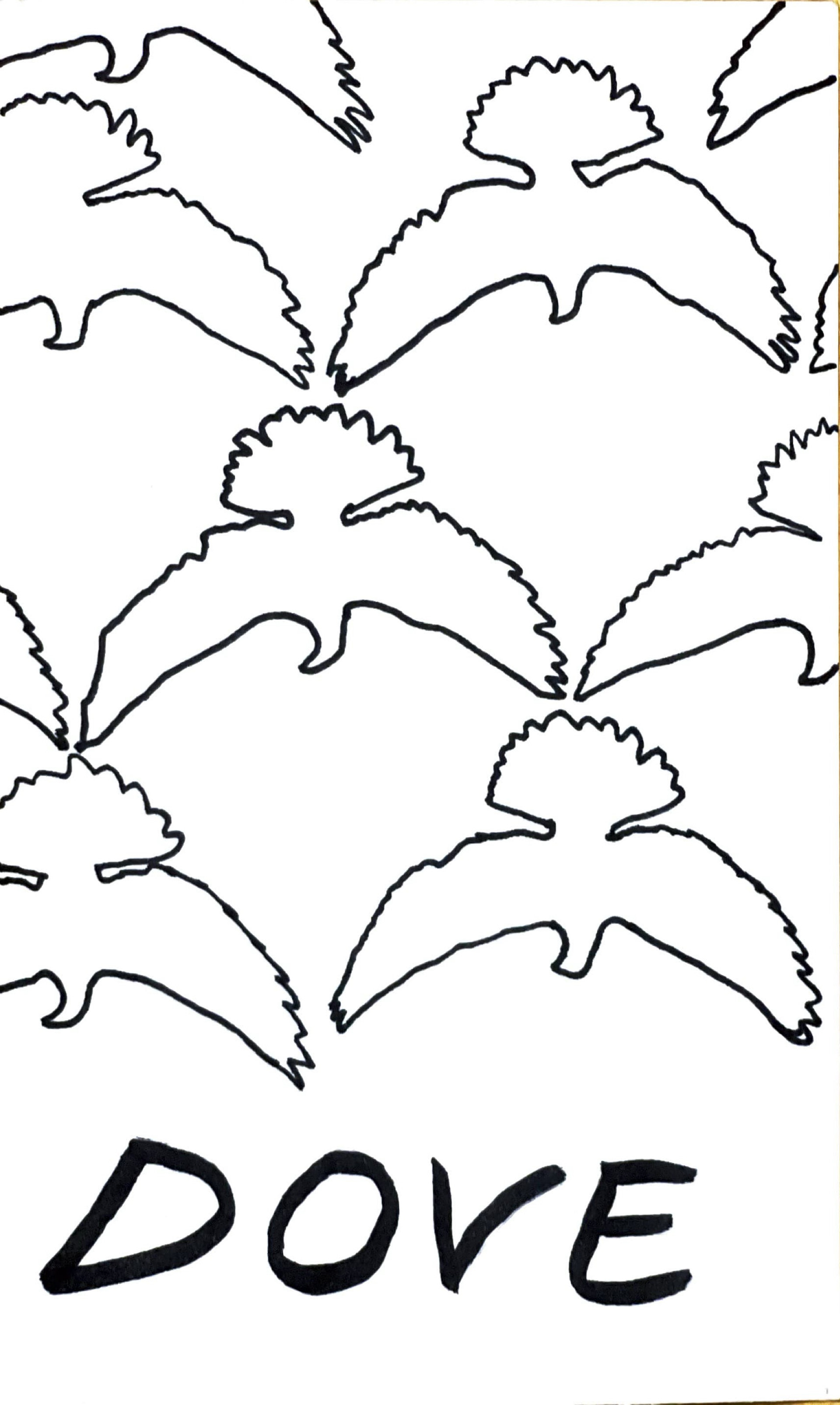
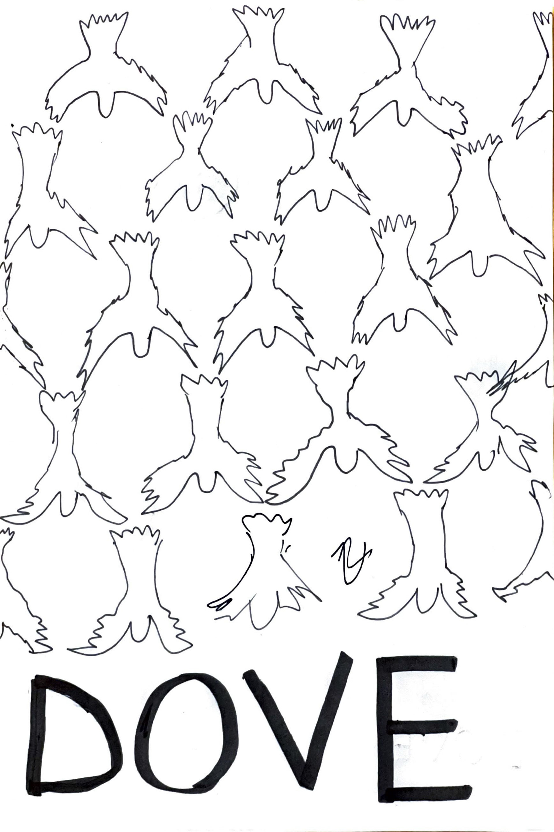
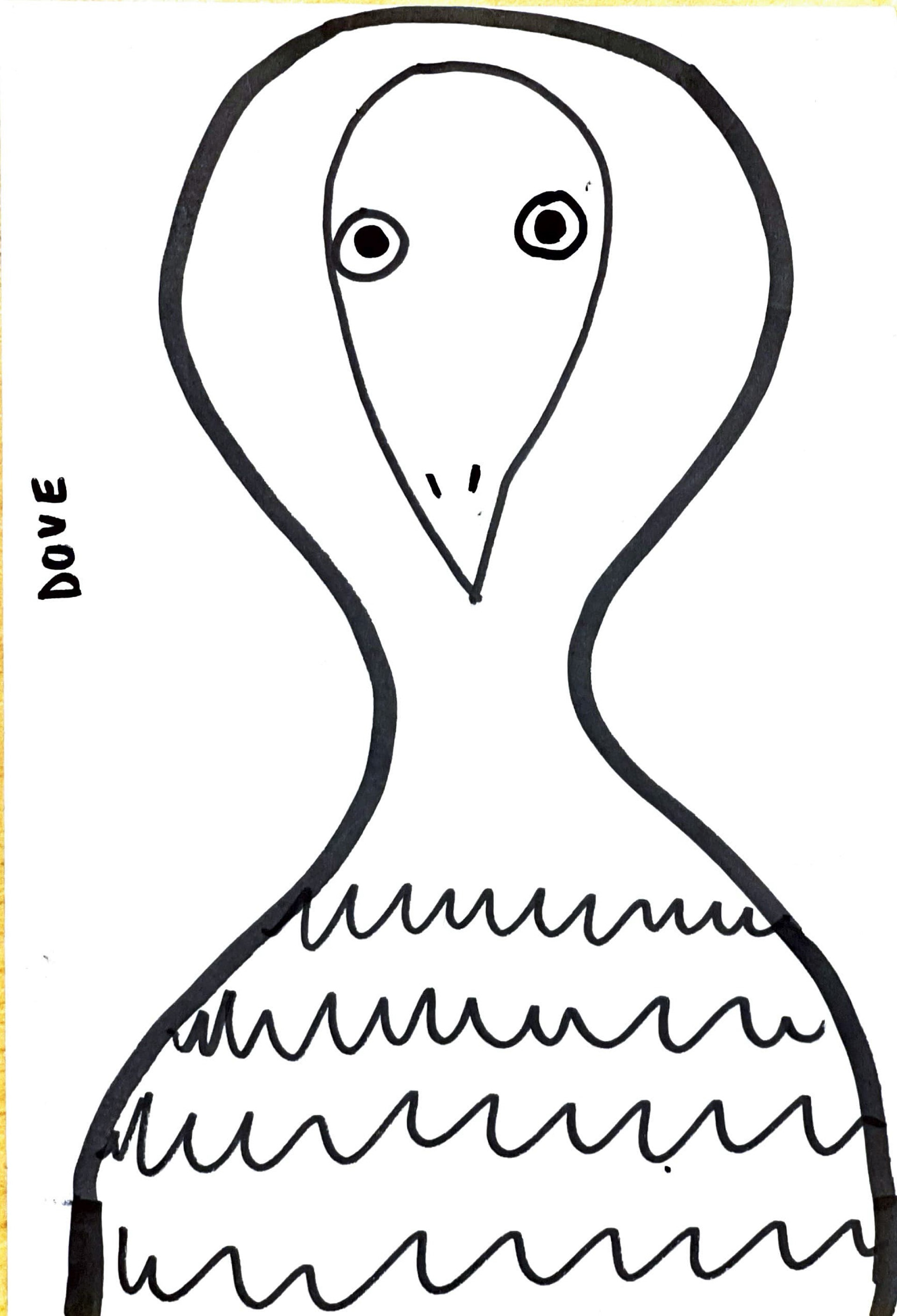
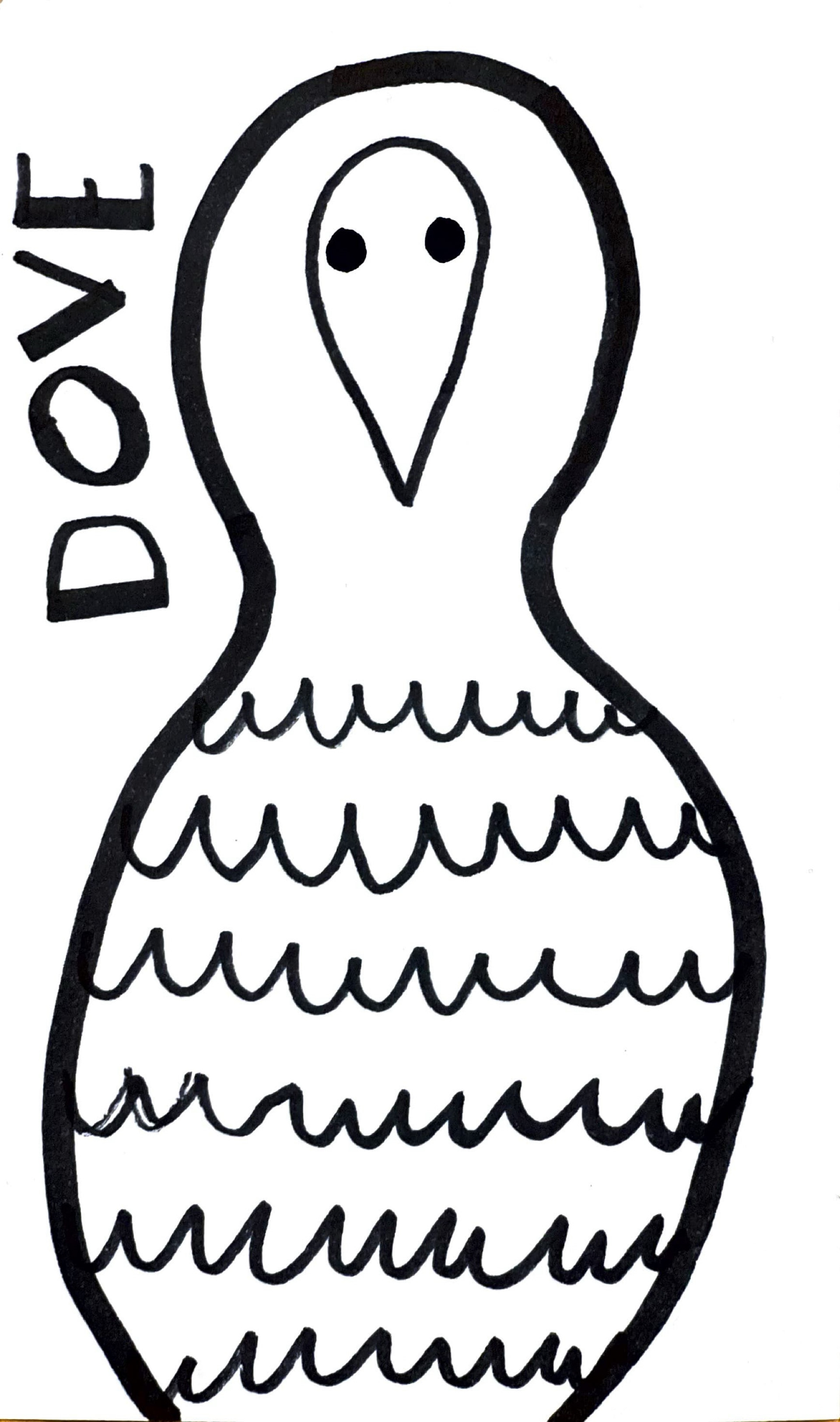
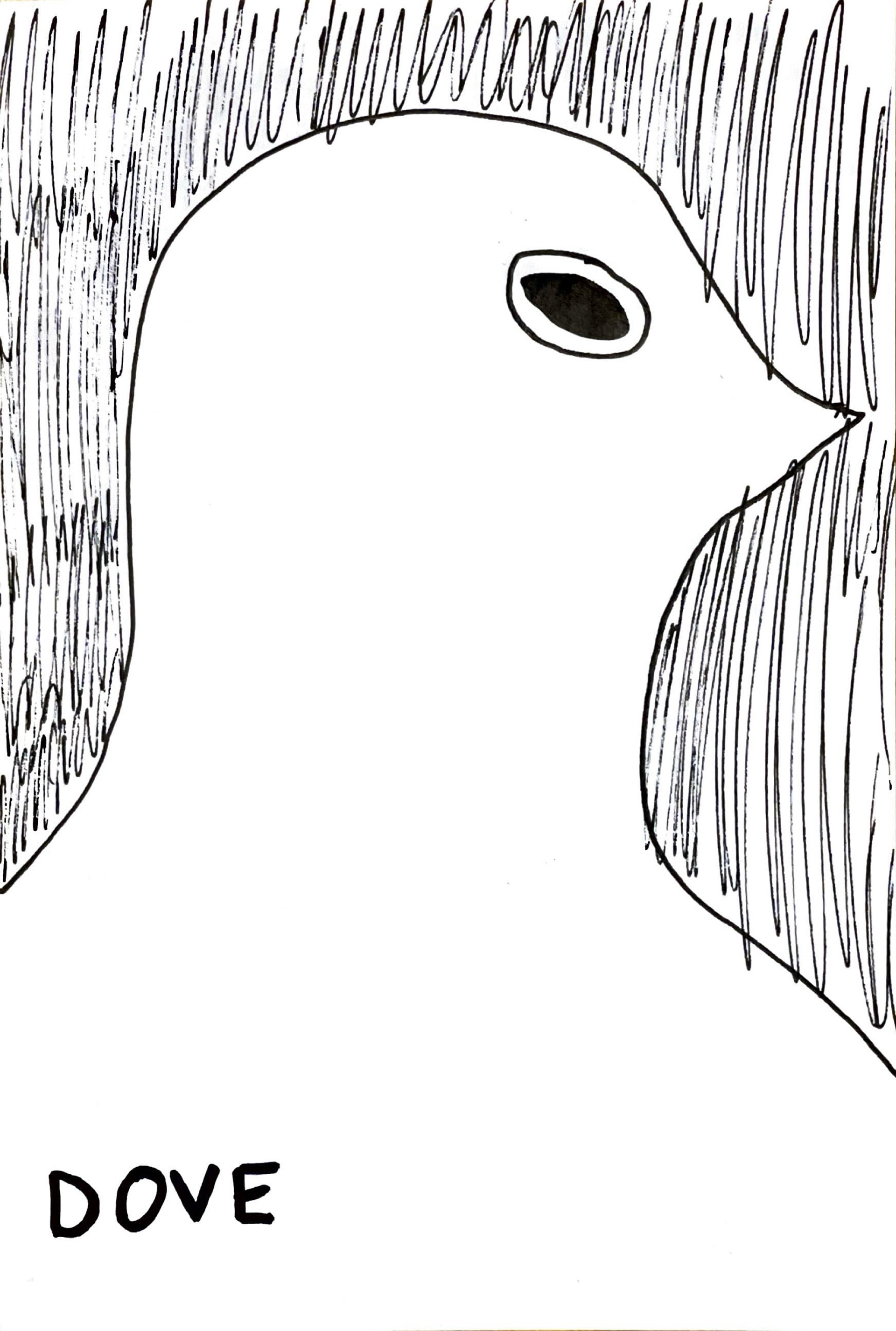
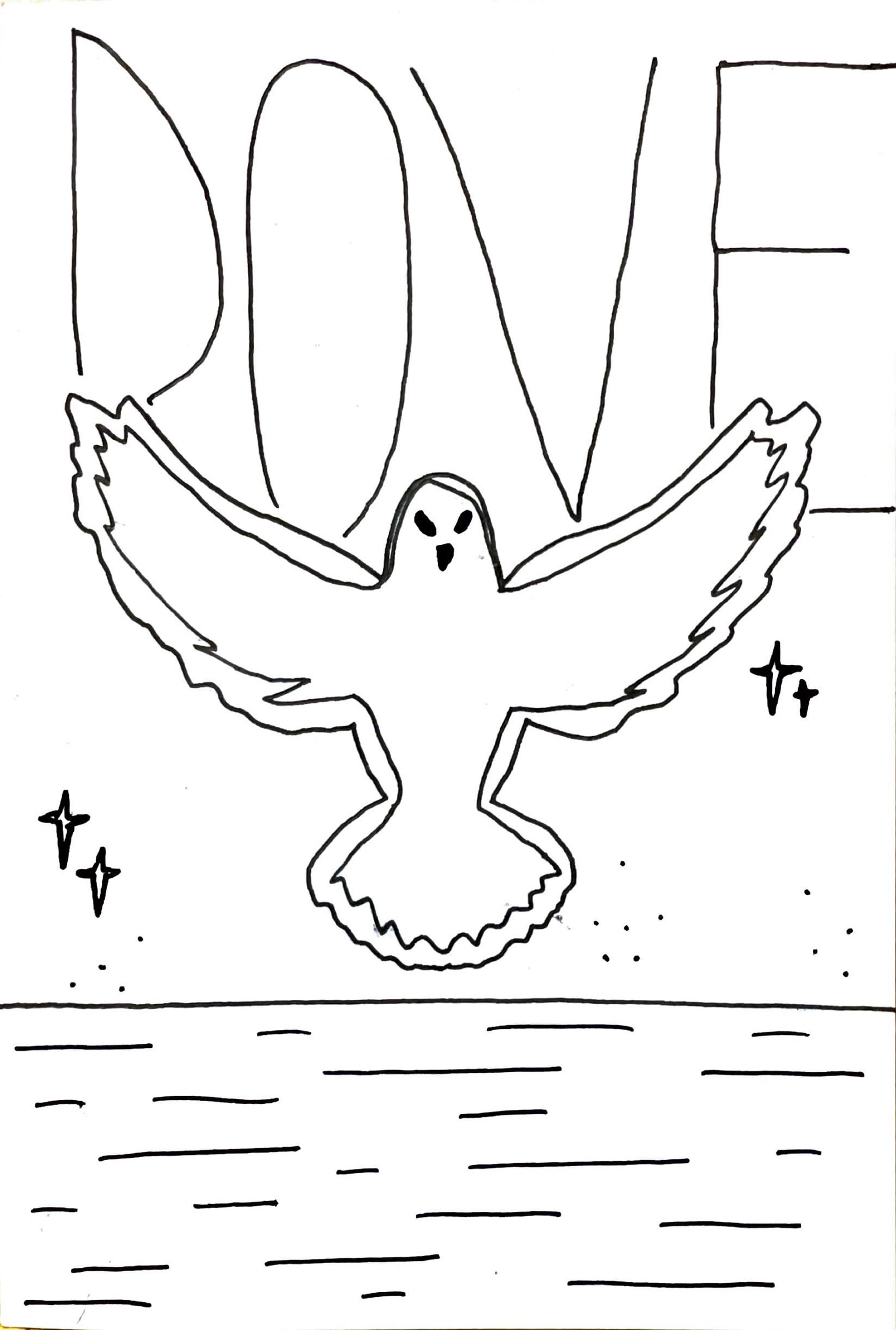
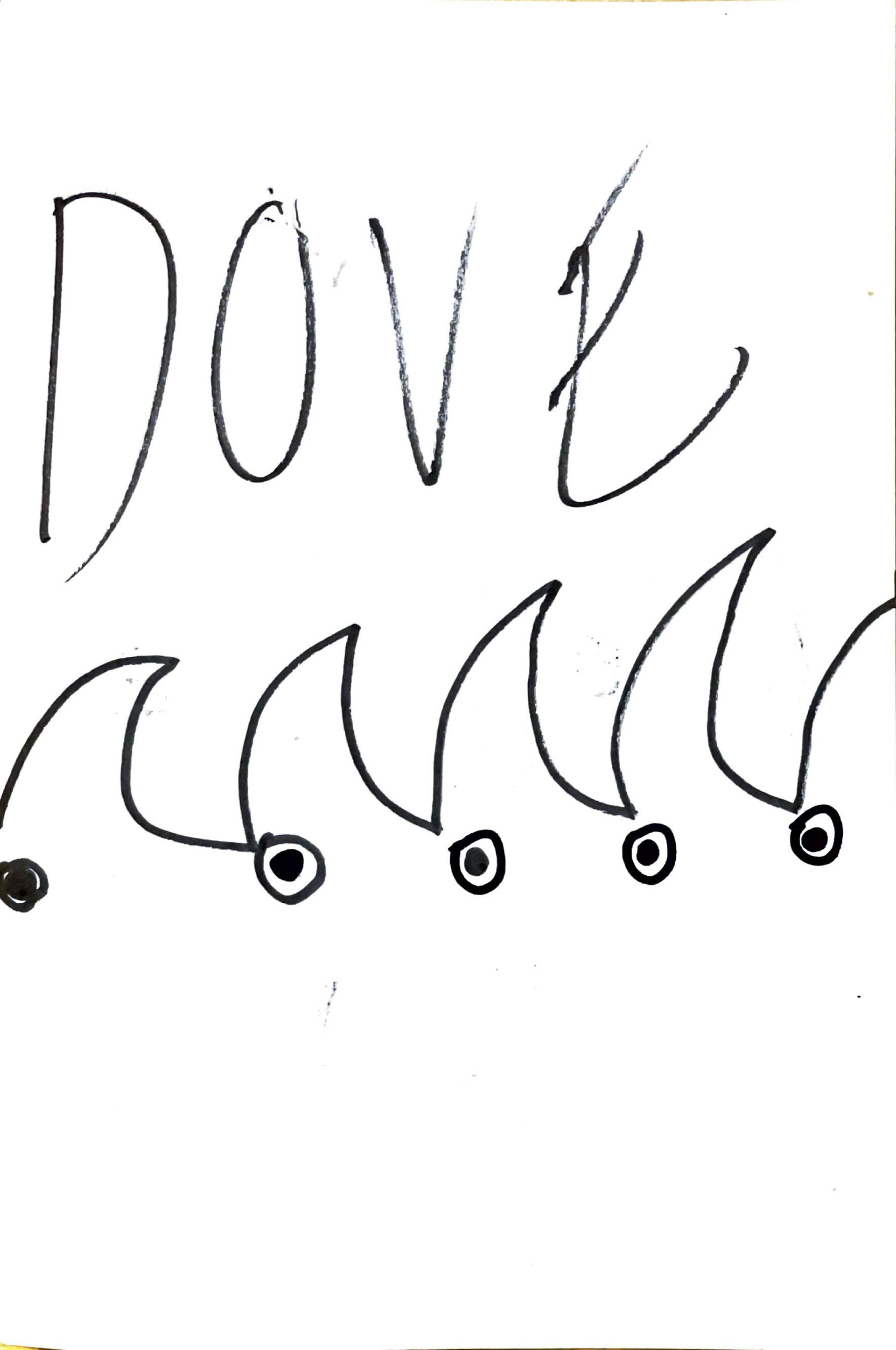
My sketching process involved drawing various dove focused designs. I went with different sizes, positioning and overall composition through rough sketches. I ended up going with the dove in the right corner.
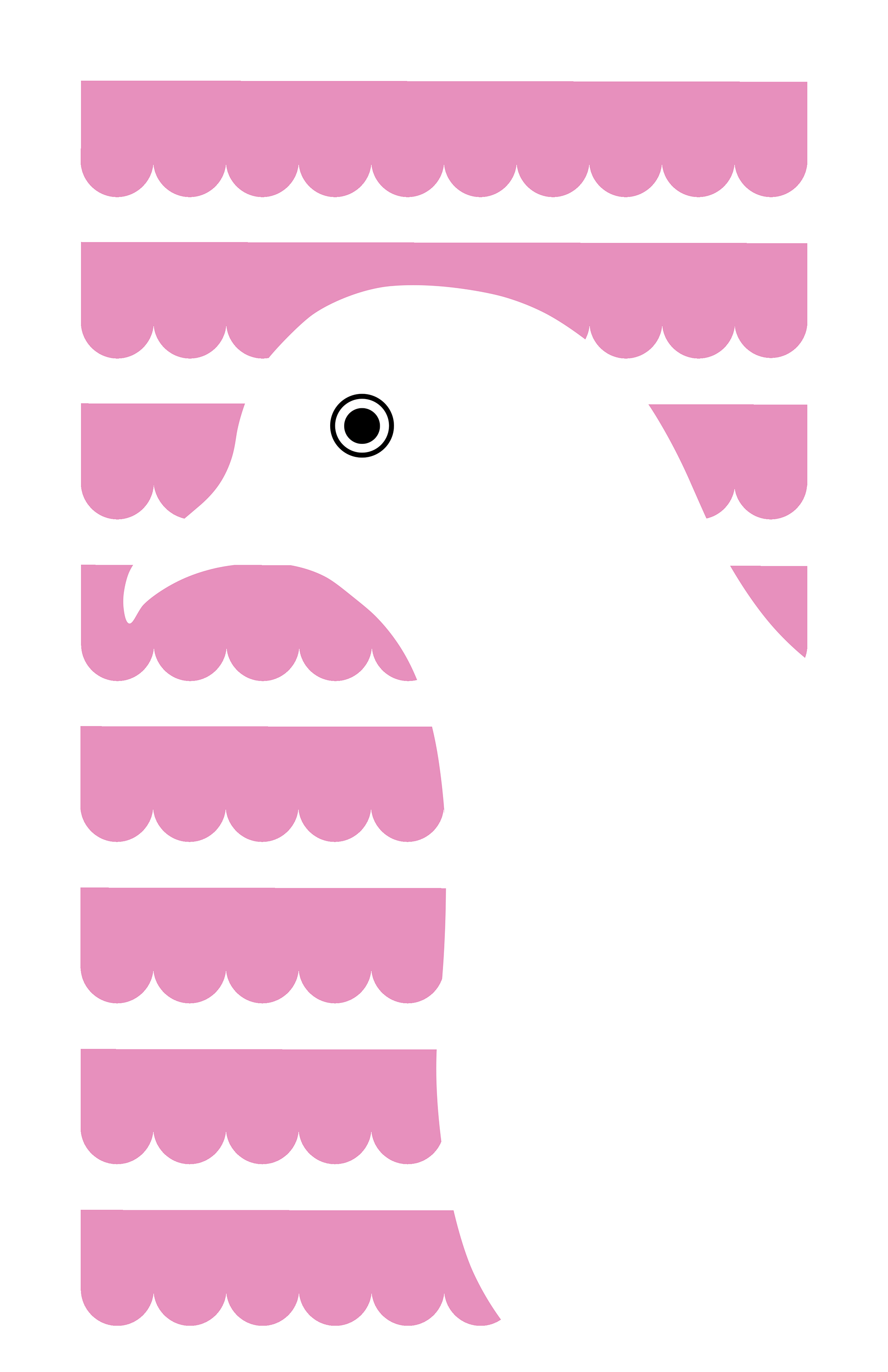

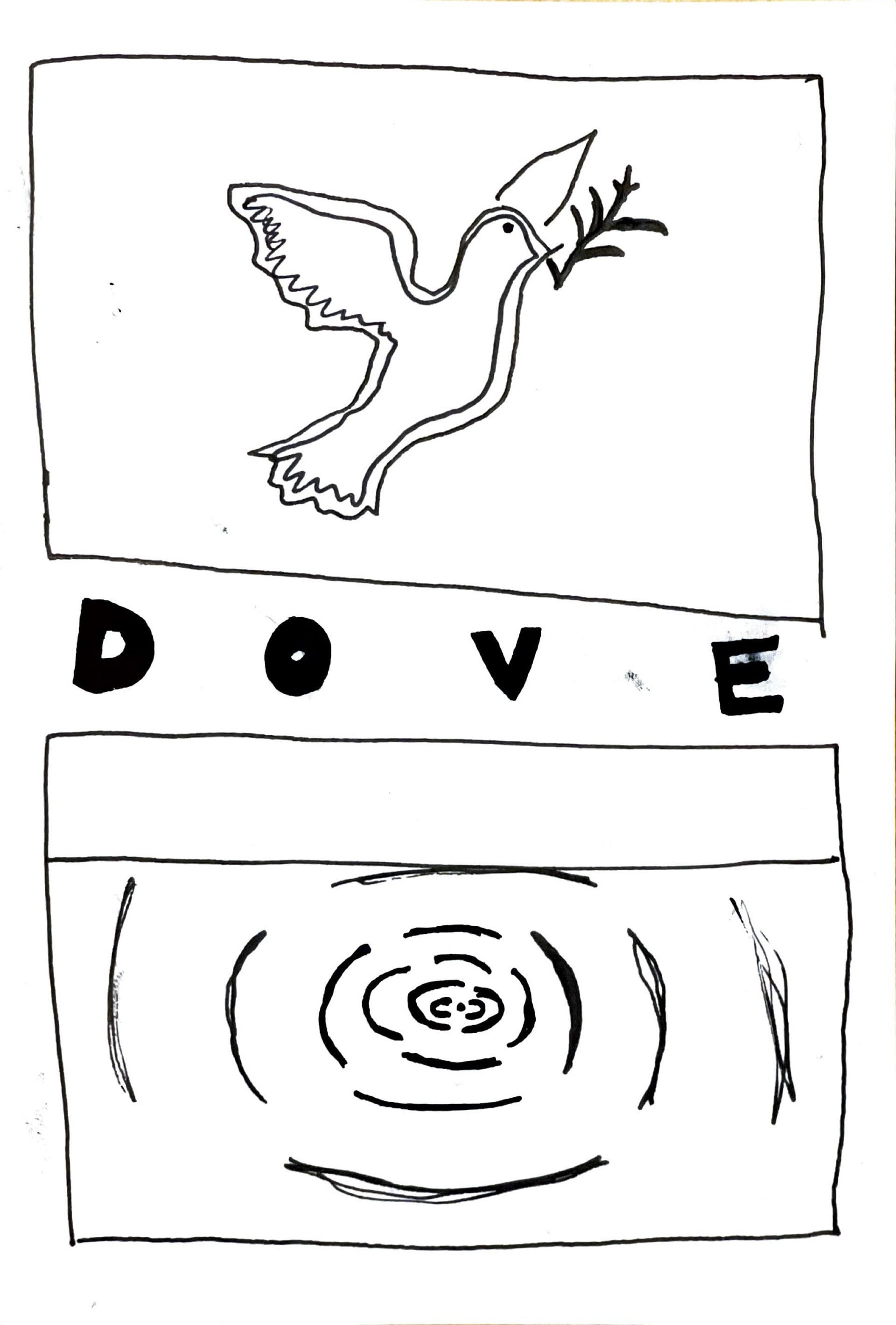
My editing process involved playing with different scales of the dove, positioning of the waves in the background, and changing the size of the Japanese character that translated into DOVE. I played around with different colors but ended up going with a nice blue, which reminded me of screen printing.
I also was feeling very inspired and made a second poster with the a Crane as my design focus, following similar design principles in the process.
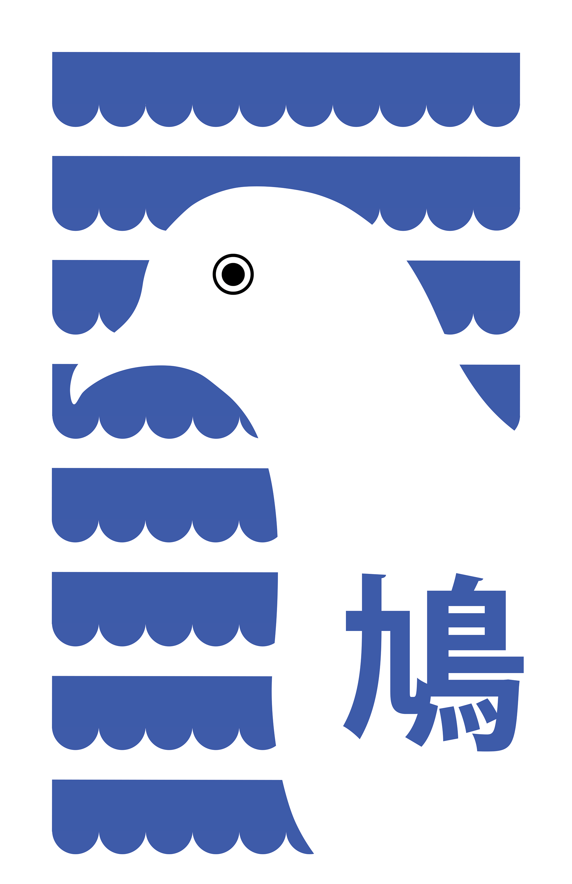
The final project is something I’m very proud of. It will definitely be used in my portfolio. I really like the minimalistic design and it really came out how I envisioned it in the final product.