
The project brief for this assignment had us making a promotional advertisement for a real/fictional event using our logo we had created in the first part. Mostly, specific requirements like dates and a description of the event were laid out. However, part of this project included thumbnail sketches to brainstorm ideas.
There wasn’t much of a research part of this project. The only “research” I did was looking at museum event/exhibition flyers for inspiration in terms of layout.
The sketching process involved jotting down quick ideas into small pieces of paper to gain an idea of positioning, content, themes and execution. Poorly drawn thumbnail sketches didn’t provide me with much, as this is something I’ve never really done, but it helped me visualize things I didn’t want, and some things I did. So maybe it did actually help me in the end.
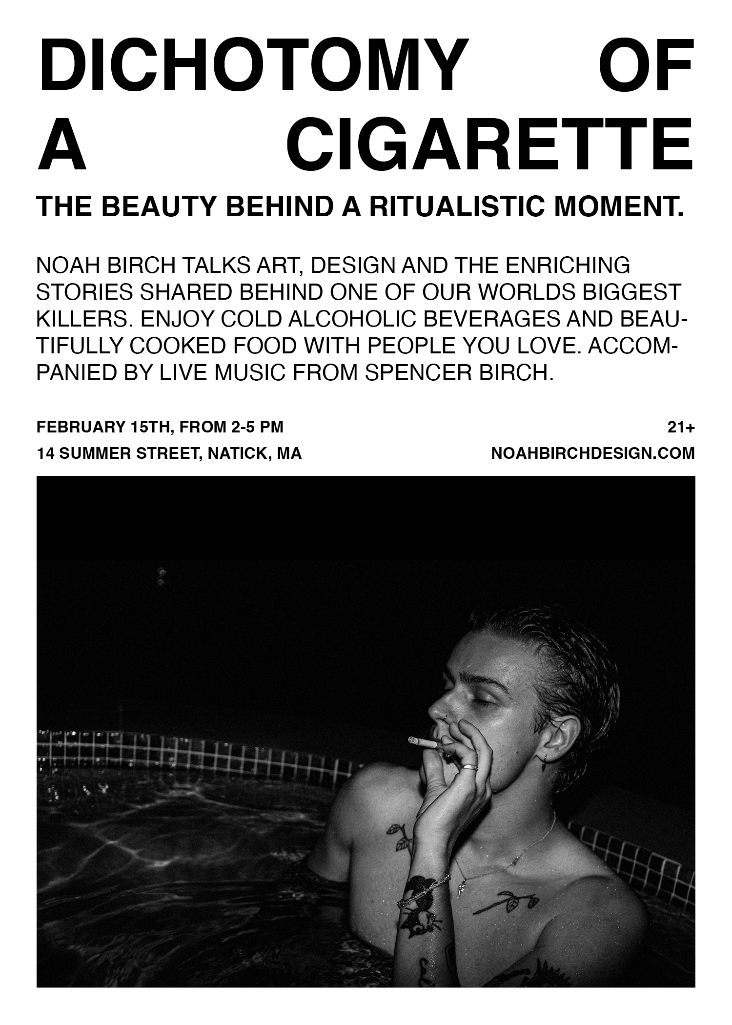
The overall design I went for was simple and easy to read. I wanted it to look modern but kind of punk at the same time. The only real editing I did was with text sizing, alignment and positioning of the image and text. I played around for A LONG TIME, trying to fit the postcard well without having it feel overrun with text.


The final image is something I’m proud of. It's clean and could definitely see light within my portfolio. I’m happy with the overall design choices I made and I really liked this project.